Custom Sizzix Dies for Corporate Gifts: A Die-Cut Order Checklist
-
Check 1: Write down the die-cutting machine like it's a shipping address
-
Check 2: Ask for the die-line template before you approve final artwork
-
Check 3: Put the material spec in the PO, not in an email
-
Check 4: Use Pantone codes, and proof on the real material
-
Check 5: Make the test cut non-optional
-
Check 6: Do the math on waste and print resolution
-
Check 7: If you outsource promotional products order entry, use a formal handoff
-
Final thought
For the past eight years, I have been the person who signs purchase orders for corporate gift programs. That means I have also been the person who signs the mistakes. In my first year (2017), I made the classic specification error: I assumed the term 'standard die size' meant the same thing to every vendor. It didn't. The custom die we approved could not run on the production machine we were using. That mistake cost about $580 in die charges plus a one-week delay.
Since then, I built a checklist. Over the last 18 months, it has caught 47 potential errors before they reached production. This post is that checklist. It's written for anyone buying custom Sizzix dies or using Sizzix die cutting machines for personalized gift and corporate gift work. If you also outsource promotional products order entry, the last section is worth your time on its own.
Check 1: Write down the die-cutting machine like it's a shipping address
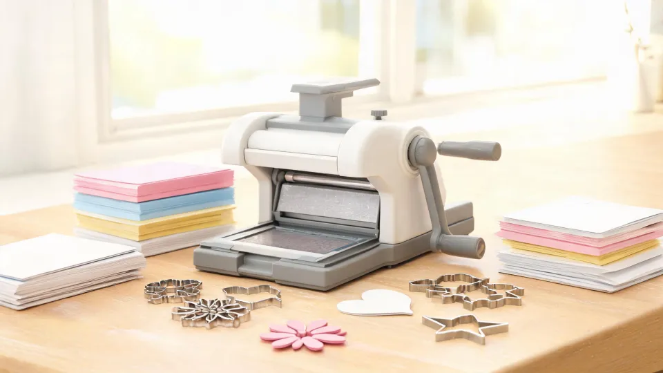
Sizzix die cutting machines are a product family, not a single spec. A die that works on one model may be too large for another. If production is running a sizzix mini die cutting machine, write that exact machine name on the purchase order. Don't write 'fits Sizzix.' It sounds fine until the die arrives and nobody can run it.
Include three details on every line item:
Machine model / Maximum die size / Maximum material thickness
This is one of those checks that feels unnecessary until it isn't. Custom Sizzix dies are made to spec. Once they're made, you cannot shrink them with a mouse click.
Check 2: Ask for the die-line template before you approve final artwork
Obvious? Maybe not. A die-cut product has two separate components: the printed design and the cut line. They are not the same file, and they should not be merged into one flattened PDF.
Ask your die maker for their die-line template first. If they don't have one, ask what minimum positive and negative dimensions they recommend. That question would have saved us from an elegant design with flourishes that were too thin. It looked beautiful on screen and tore like wet paper in the first test cut. Another $320 spent, plus three days.
It's tempting to think if it looks right on your monitor, it will cut cleanly. The machine doesn't see it that way. If the design has text, convert it to outlines. If you're sending raster artwork, send it at 300 DPI at final size. If a vendor asks for vector files, don't argue—send vectors.
Check 3: Put the material spec in the PO, not in an email
If your spec says '100 lb paper,' you have not specified the material. 100 lb text is around 150 gsm, while 100 lb cover is around 270 gsm. They cut differently, fold differently, and die-cut differently.
Here's the conversion I keep pinned above my desk:
- 20 lb bond = 75 gsm
- 24 lb bond = 90 gsm
- 80 lb text = 120 gsm
- 100 lb text = 150 gsm
- 80 lb cover = 216 gsm
- 100 lb cover = 270 gsm
If the order is for a corporate gift box or greeting card made with 80 lb cover, write '80 lb cover / 216 gsm' and the supplier's product code if you have it. This sounds like overkill until a well-intentioned buyer substitutes 80 lb text because the number matches. That substitution changes the weight, stiffness, and folding behavior.
Check 4: Use Pantone codes, and proof on the real material
Screen colors are not print colors. For any branded element on a custom gift, I ask the client for a Pantone code. If they send me a hex code from their website, I ask again.
It's tempting to think you can just compare the RGB values. But Pantone 286 C, a common corporate blue, converts to approximately C:100 M:66 Y:0 K:2 in CMYK. The result still depends on the press, the coating, and the substrate. A proof on bright white cardstock does not predict what the same color looks like on kraft paper.
That exact mistake happened in September 2022. We approved a navy logo on a white-cardstock proof. Production was on kraft cardstock. The navy came out looking purple. The client rejected 2,000 pieces. Redo cost us $890 plus a week of schedule. After that, I added one rule: no bulk production until a color proof is run on the actual material.
For brand-critical colors, ask your printer what Delta E tolerance they will hold. The industry standard for brand-critical colors is Delta E less than 2. Delta E from 2 to 4 is noticeable to trained observers. If your supplier won't talk in those terms, keep asking.
Check 5: Make the test cut non-optional
If you are ordering custom dies, build a test cut into the timeline before the production deadline. A digital mockup shows a shape. It does not show how paper splits, how a die compresses, or whether the material jams in the machine.
Ask for a physical sample on the exact material you plan to use. If the vendor says they will do a test cut during production, that means they are testing after they have already started your order. That's not a test; it's a discovery process with your delivery date at risk.
This rule matters even more when the design has thin sections, small lettering, or intricate edges. A 1-millimeter difference in the die can make a product look cheap or cause materials to tear. Test cuts are not optional for those designs.
Check 6: Do the math on waste and print resolution
In die-cut production, the quantity you need is rarely the quantity you should order. Add a waste factor for cutting defects, misprints, and damaged pieces during packaging. For simple die-cut tags, I add roughly 5 percent. If the piece is also printed or personalized after cutting, I add up to 10 percent.
There's another math check that often gets forgotten: print resolution. If you receive a 3000 x 2000 pixel image and you want to print it at 300 DPI, the maximum clean size is 10 x 6.67 inches. You cannot stretch it to 12 inches wide and keep the same quality. The formula is simple: pixel width divided by 300 equals maximum print width in inches.
It's better to catch these numbers before you commit to a quantity. Once the die is made and the material is ordered, small print-quality issues become expensive compromises.
Check 7: If you outsource promotional products order entry, use a formal handoff
I need to be honest here. I have mixed feelings about outsourcing promotional products order entry. It saves us during peak season, but a remote data entry operator doesn't know what a die line is, or why 80 lb cover and 80 lb text are different. That's not their fault. It's my fault if I don't send them clear data.
If you ask the question 'how to outsource promotional products order entry without losing accuracy,' the answer is to stop sending information through informal channels. No screenshots of an email. No 'everything is in the attached PDF.'
We now use a handoff sheet with exactly these fields:
PO number / client PO / ship-to name and address / item description / Sizzix die cutting machine model / die name or number / material and weight / Pantone colors / artwork file name and version / quantity in digits / quantity in words / in-hands date
The quantity-in-words field looks old-fashioned, but it catches typos. In Q1 2024, a temporary data entry processor entered '12,000' when the order was for '1,200.' The digits looked like they could be right. The words did not. That single field caught a mistake that would have delayed the order by several days.
Ask the person entering the order to read back the machine model, material, and quantity before the order goes to production. It takes thirty seconds. It also forces them to look at the order as a physical item instead of a pile of fields.
Final thought
Every mistake in this checklist was paid for with either budget or timeline. The most expensive sentence in our industry is 'I thought that was already confirmed.' If you're ordering ten pieces or ten thousand pieces, put it in the PO. Write the machine model, material, Pantone code, quantity, and handoff data in plain words. The next person in the chain will not be able to read your mind—but they will be able to follow the purchase order.

Elise Laurent is a crystal and decorative glass quality analyst covering crystal figurines, vases, ornaments, suncatchers, and gift glassware. She examines ISO 6486-1 where food-contact glass dinnerware applies, then uses polarized strain inspection, dimensional checks, surface-defect grading, and refractive clarity to compare decorative pieces outside that scope. Her work helps sourcing teams choose materials, finishing routes, and protective packaging without confusing visual brilliance with verified durability.